FRIEDRICHS RESERVE SHIRAZ
FRIEDRICHS RESERVE SHIRAZ
The 1999 Friedrichs Reserve Shiraz from Cape Town is a beautifully matured South African red, showcasing the depth and complexity that only time can bring. In the glass, it reveals a deep garnet core with soft brick hues at the edge, hinting at its age. The nose is rich with notes of blackberry, dried plum, and cassis, layered with earthy spice, cracked pepper, and subtle hints of leather and tobacco. Oak aging adds undertones of vanilla, dark chocolate, and cedar, while a touch of Cape floral character brings a distinctly local elegance. The palate is smooth and full-bodied, with fine-grained tannins and a lingering finish of mocha, black cherry, and warm spice, making this a refined example of a classic Cape Shiraz.
Concept
Concept
The concept for the 1999 Friedrichs Reserve Shiraz label was born from a fusion of French elegance and Cape Town’s rich wine heritage. I drew inspiration from traditional French wine labels—particularly those from Bordeaux and the Rhône Valley—focusing on their ornate line work, serif typography, and restrained color palettes that communicate legacy and craftsmanship. At the same time, I wanted to ground the design in its South African roots by reflecting the bold character and natural beauty of the Cape. This balance guided my use of vintage scroll motifs and grapevine illustrations, combined with a clean, symmetrical layout that respects French tradition while embracing the strength and individuality of a Cape Shiraz. The result is a design that feels timeless, yet distinctly local.
The concept for the 1999 Friedrichs Reserve Shiraz label was born from a fusion of French elegance and Cape Town’s rich wine heritage. I drew inspiration from traditional French wine labels—particularly those from Bordeaux and the Rhône Valley—focusing on their ornate line work, serif typography, and restrained color palettes that communicate legacy and craftsmanship. At the same time, I wanted to ground the design in its South African roots by reflecting the bold character and natural beauty of the Cape. This balance guided my use of vintage scroll motifs and grapevine illustrations, combined with a clean, symmetrical layout that respects French tradition while embracing the strength and individuality of a Cape Shiraz. The result is a design that feels timeless, yet distinctly local.
Concept
The concept for the 1999 Friedrichs Reserve Shiraz label was born from a fusion of French elegance and Cape Town’s rich wine heritage. I drew inspiration from traditional French wine labels—particularly those from Bordeaux and the Rhône Valley—focusing on their ornate line work, serif typography, and restrained color palettes that communicate legacy and craftsmanship. At the same time, I wanted to ground the design in its South African roots by reflecting the bold character and natural beauty of the Cape. This balance guided my use of vintage scroll motifs and grapevine illustrations, combined with a clean, symmetrical layout that respects French tradition while embracing the strength and individuality of a Cape Shiraz. The result is a design that feels timeless, yet distinctly local.
Research
Research
This design study explores the label of the 1999 Friedrichs Reserve Shiraz, a South African wine from Cape Town, focusing on how visual elements convey heritage, elegance, and varietal identity. The cream-toned background paired with deep burgundy typography evokes a sense of tradition and premium quality, while ornamental scrollwork and grapevine motifs reinforce its classic character. Serif fonts and symmetrical layout choices enhance readability and elevate the label’s formal appeal. The research examines how these design elements align with consumer expectations for a mature Shiraz, particularly in the reserve category, and whether the vintage year and varietal are communicated clearly and attractively. This paragraph serves as a foundation for evaluating the design’s effectiveness in both retail settings and brand storytelling.
This design study explores the label of the 1999 Friedrichs Reserve Shiraz, a South African wine from Cape Town, focusing on how visual elements convey heritage, elegance, and varietal identity. The cream-toned background paired with deep burgundy typography evokes a sense of tradition and premium quality, while ornamental scrollwork and grapevine motifs reinforce its classic character. Serif fonts and symmetrical layout choices enhance readability and elevate the label’s formal appeal. The research examines how these design elements align with consumer expectations for a mature Shiraz, particularly in the reserve category, and whether the vintage year and varietal are communicated clearly and attractively. This paragraph serves as a foundation for evaluating the design’s effectiveness in both retail settings and brand storytelling.
Research
This design study explores the label of the 1999 Friedrichs Reserve Shiraz, a South African wine from Cape Town, focusing on how visual elements convey heritage, elegance, and varietal identity. The cream-toned background paired with deep burgundy typography evokes a sense of tradition and premium quality, while ornamental scrollwork and grapevine motifs reinforce its classic character. Serif fonts and symmetrical layout choices enhance readability and elevate the label’s formal appeal. The research examines how these design elements align with consumer expectations for a mature Shiraz, particularly in the reserve category, and whether the vintage year and varietal are communicated clearly and attractively. This paragraph serves as a foundation for evaluating the design’s effectiveness in both retail settings and brand storytelling.
Design
Design
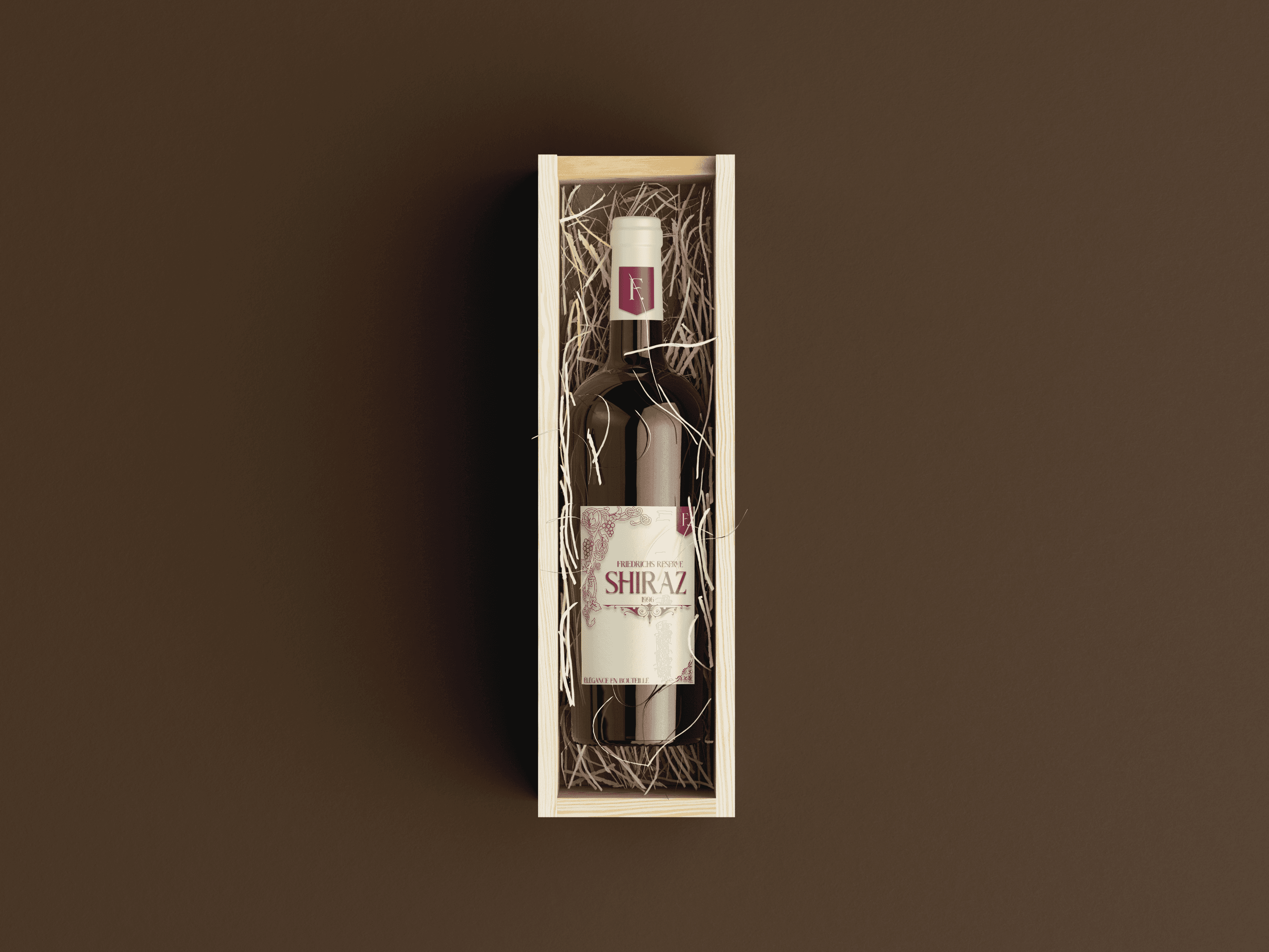
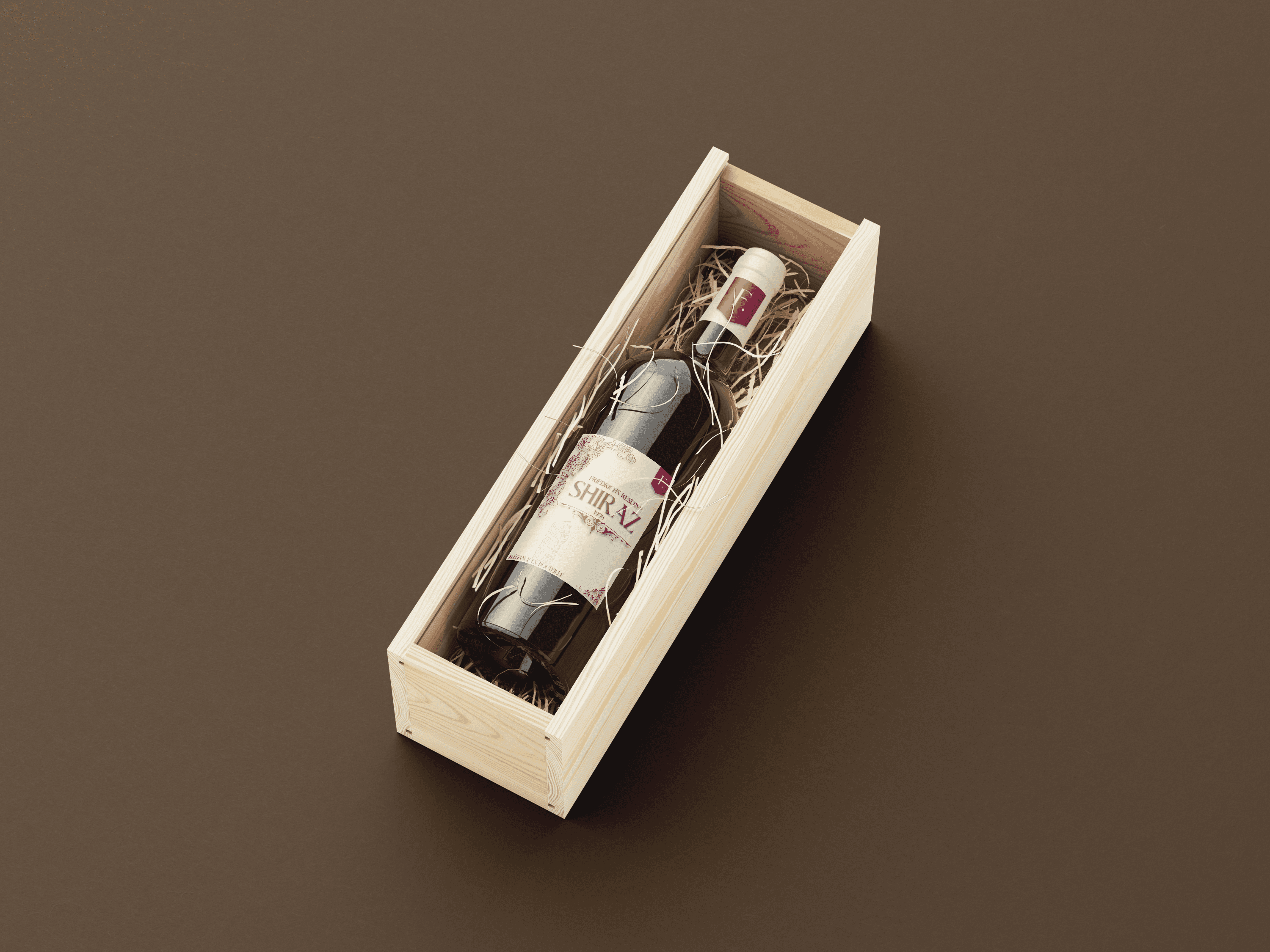
The design of the 1999 Friedrichs Reserve Shiraz label combines classic elegance with subtle detail to reflect the premium nature of a mature South African wine. A refined cream background contrasts with rich burgundy typography, creating a sense of heritage and sophistication. The use of ornate scrollwork and grapevine illustrations adds a traditional, handcrafted touch, while the bold, serif “Shiraz” lettering ensures clear varietal recognition. The layout is clean and balanced, with the vintage year prominently centered beneath the name, reinforcing the wine’s age and exclusivity.
The design of the 1999 Friedrichs Reserve Shiraz label combines classic elegance with subtle detail to reflect the premium nature of a mature South African wine. A refined cream background contrasts with rich burgundy typography, creating a sense of heritage and sophistication. The use of ornate scrollwork and grapevine illustrations adds a traditional, handcrafted touch, while the bold, serif “Shiraz” lettering ensures clear varietal recognition. The layout is clean and balanced, with the vintage year prominently centered beneath the name, reinforcing the wine’s age and exclusivity.
Design
The design of the 1999 Friedrichs Reserve Shiraz label combines classic elegance with subtle detail to reflect the premium nature of a mature South African wine. A refined cream background contrasts with rich burgundy typography, creating a sense of heritage and sophistication. The use of ornate scrollwork and grapevine illustrations adds a traditional, handcrafted touch, while the bold, serif “Shiraz” lettering ensures clear varietal recognition. The layout is clean and balanced, with the vintage year prominently centered beneath the name, reinforcing the wine’s age and exclusivity.
More Works More Works
More Works More Works


©2024 EMPYREAN DESIGN CO
©2024 EMPYREAN DESIGN CO