NEON VEINS
NEON VEINS
Neon Veins by Crystal Zero is a hard-hitting fusion of hard rock and alternative, pulsing with raw energy, distortion-heavy riffs, and gritty emotion. The album explores themes of digital identity, fractured reality, and synthetic emotion — expressed through intense sonic layering and futuristic lyrical motifs. The sound is equally aggressive and atmospheric, demanding a visual identity that speaks to both the analog roots of rock and the digital edge of modern rebellion.
Concept
Concept
The concept behind the Neon Veins artwork was to visualize the tension between human emotion and digital overload. I was inspired by the visual language of cyberpunk, glitch art, and old-school physical media culture — especially the rawness of stickered CD cases in record stores. The red-and-blue palette nods to electricity, pulse, and opposing energies, while the circuit design suggests that our identities — like machines — are built from inputs and signals. The final artwork captures that blend of emotion, artificiality, and defiance that defines both the sound of the album and the world it critiques.
The concept behind the Neon Veins artwork was to visualize the tension between human emotion and digital overload. I was inspired by the visual language of cyberpunk, glitch art, and old-school physical media culture — especially the rawness of stickered CD cases in record stores. The red-and-blue palette nods to electricity, pulse, and opposing energies, while the circuit design suggests that our identities — like machines — are built from inputs and signals. The final artwork captures that blend of emotion, artificiality, and defiance that defines both the sound of the album and the world it critiques.
Concept
The concept behind the Neon Veins artwork was to visualize the tension between human emotion and digital overload. I was inspired by the visual language of cyberpunk, glitch art, and old-school physical media culture — especially the rawness of stickered CD cases in record stores. The red-and-blue palette nods to electricity, pulse, and opposing energies, while the circuit design suggests that our identities — like machines — are built from inputs and signals. The final artwork captures that blend of emotion, artificiality, and defiance that defines both the sound of the album and the world it critiques.
Research
Research
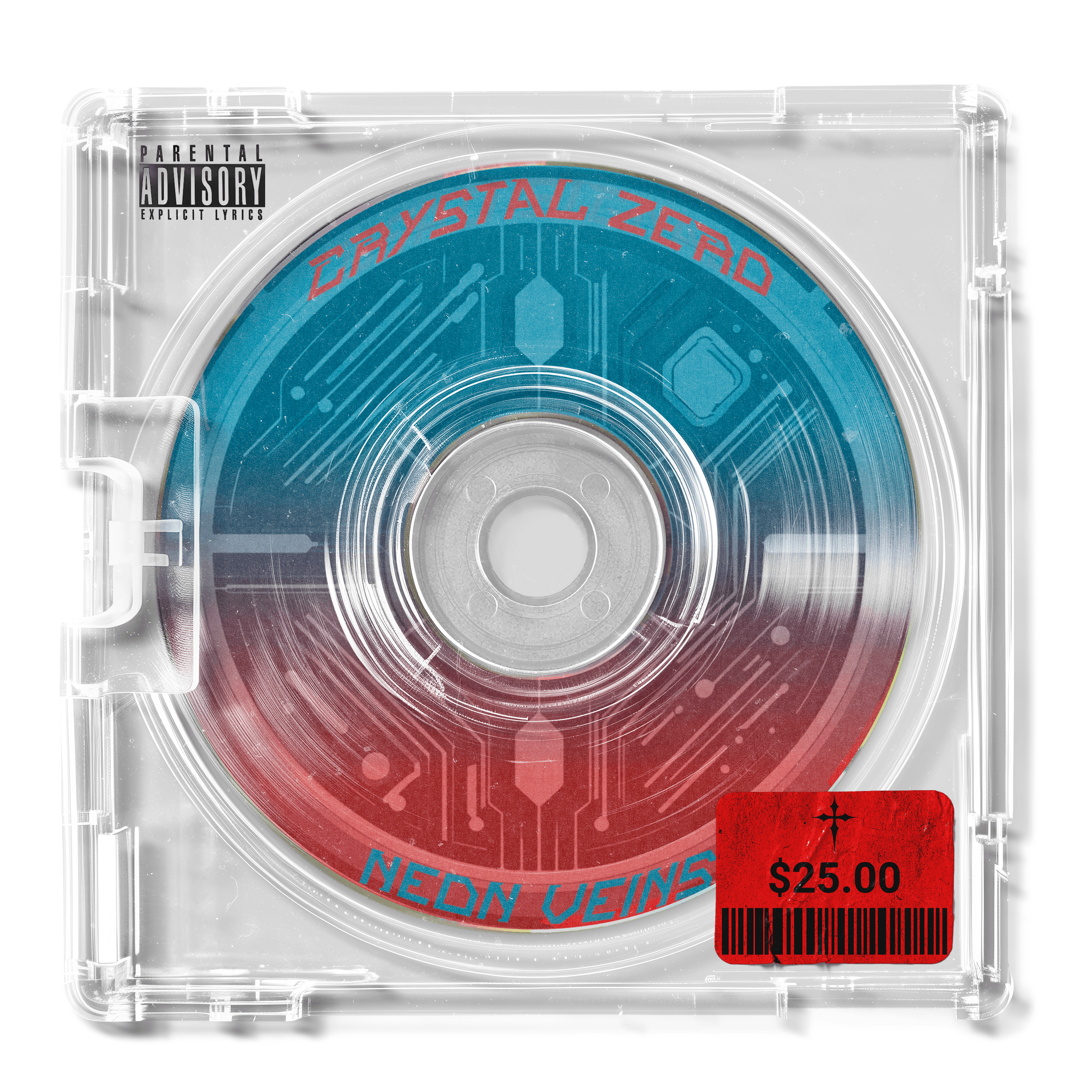
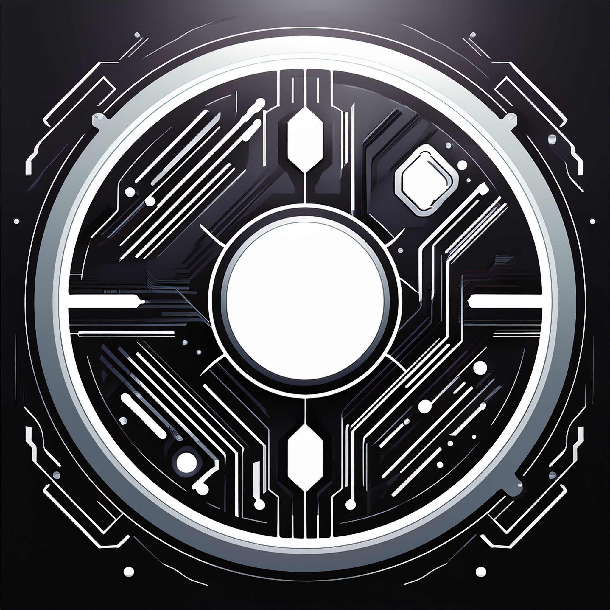
The visual identity for Neon Veins is a deliberate collision of cybernetic and punk influences. The CD face features a circuitry-inspired disc design, referencing both vinyl grooves and tech schematics, rendered in a bold blue-to-red gradient that reflects the “neon” concept in both color and theme. The jagged, glitchy typography for the band name and album title adds a sense of urgency and chaos, while the layered textures bring a gritty, underground edge. A high-contrast red barcode price sticker adds a raw, rebellious commercial aesthetic — reminiscent of bootleg culture and dystopian consumerism.
The visual identity for Neon Veins is a deliberate collision of cybernetic and punk influences. The CD face features a circuitry-inspired disc design, referencing both vinyl grooves and tech schematics, rendered in a bold blue-to-red gradient that reflects the “neon” concept in both color and theme. The jagged, glitchy typography for the band name and album title adds a sense of urgency and chaos, while the layered textures bring a gritty, underground edge. A high-contrast red barcode price sticker adds a raw, rebellious commercial aesthetic — reminiscent of bootleg culture and dystopian consumerism.
Research
The visual identity for Neon Veins is a deliberate collision of cybernetic and punk influences. The CD face features a circuitry-inspired disc design, referencing both vinyl grooves and tech schematics, rendered in a bold blue-to-red gradient that reflects the “neon” concept in both color and theme. The jagged, glitchy typography for the band name and album title adds a sense of urgency and chaos, while the layered textures bring a gritty, underground edge. A high-contrast red barcode price sticker adds a raw, rebellious commercial aesthetic — reminiscent of bootleg culture and dystopian consumerism.
Design
Design
The development process began with the album’s sonic tone — abrasive yet atmospheric — which inspired the contrast of synthetic geometry with distressed textures. I researched cyberpunk media, industrial album art, and techwear branding to form a visual vocabulary. The circular design was built using a grid to echo microchip layouts, then overlaid with vector noise and lighting effects for visual depth. The red label was developed as an intentional visual disruption, evoking themes of commodification and rebellion. Several iterations were tested in mockups to ensure high impact when viewed both digitally and physically.
The development process began with the album’s sonic tone — abrasive yet atmospheric — which inspired the contrast of synthetic geometry with distressed textures. I researched cyberpunk media, industrial album art, and techwear branding to form a visual vocabulary. The circular design was built using a grid to echo microchip layouts, then overlaid with vector noise and lighting effects for visual depth. The red label was developed as an intentional visual disruption, evoking themes of commodification and rebellion. Several iterations were tested in mockups to ensure high impact when viewed both digitally and physically.
Design
The development process began with the album’s sonic tone — abrasive yet atmospheric — which inspired the contrast of synthetic geometry with distressed textures. I researched cyberpunk media, industrial album art, and techwear branding to form a visual vocabulary. The circular design was built using a grid to echo microchip layouts, then overlaid with vector noise and lighting effects for visual depth. The red label was developed as an intentional visual disruption, evoking themes of commodification and rebellion. Several iterations were tested in mockups to ensure high impact when viewed both digitally and physically.
More Works More Works
More Works More Works

©2024 EMPYREAN DESIGN CO
©2024 EMPYREAN DESIGN CO